OPPLE
- BULB PACKAGE REDESIGN -
DIRECTION 1
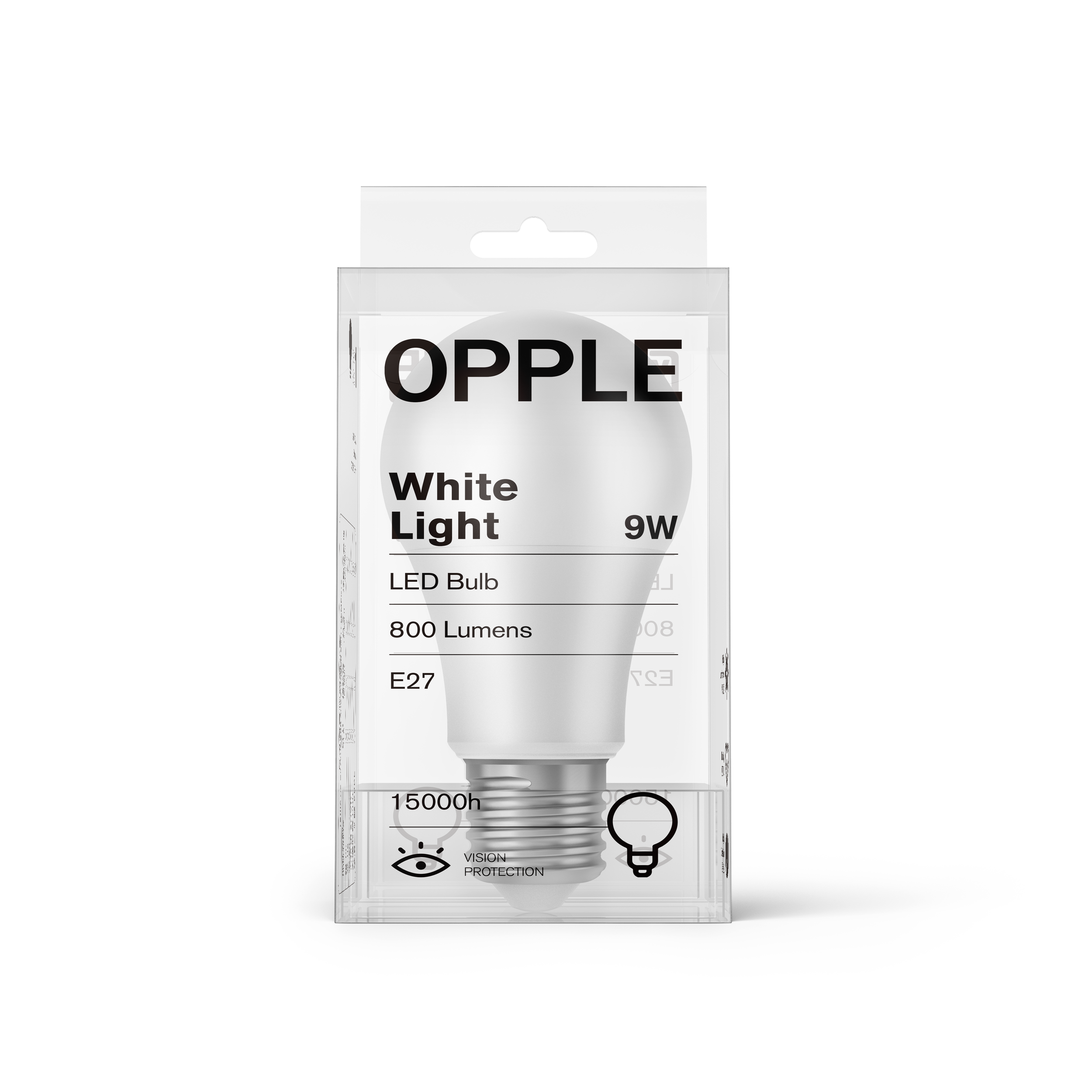
Direction one comes out with a clean and simple solution with clear material, trying to present the beautiful shape and pure color of the
bulb itself.
欧普灯泡包装再设计有两个方案。方案一采用简单干净的风格,产品信息简洁明确,使用透明包装盒,能够展示灯泡本身形状和颜色的美感。

DIRECTION 2
The second option takes different geometric shapes as visual elements with vivid colors, and they are arranged into patterns to help recognize the different wattages and brightnesses of bulbs.
方案二用几何图形组成不同的图案,辅以明亮的色彩,方便消费者区分不同的瓦数和亮度的灯泡。包装的每个面都印有瓦数信息,加强了信息传递的高效性。


